Cool
Drawing with a limited palette | Color theory in practice
There could be different reasons why you would be interested in learning how to use a limited color palette. From reducing the supplies weight in your bag when drawing on location to a better understanding of color interactions and how you achieve color harmony in your artworks, so that they look engaging.
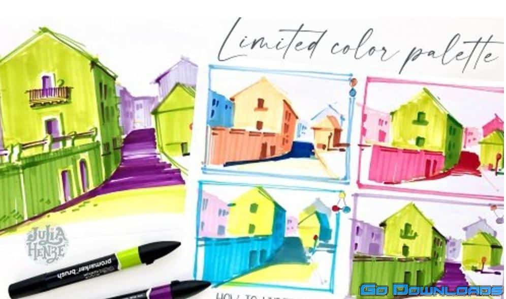
In this class, I will show you a simple method of choosing the best colors for your sketches. This method works for any materials – from traditional watercolor, gouache and acrylic paints, colored pencils, and markers to digital Procreate, Photoshop, etc.).
The palette limitation will help you understand and use colors more effectively. It’s a basis. Later, you can extend it to a wider array of colors in your palette. Or, if you’ll like drawing with a limited palette a lot, it might become your unique art style.
So, in this class, you will learn:
-
- how to read the color wheel;
-
- how colors interact with each other;
-
- how to create your own color schemes based on existing color harmonies;
-
- how to use thumbnails to make better artworks; and
-
- how to apply colors to create visual effects that will make your sketches look stronger.
For practice, we will make a sketch of an urban scene in three steps. It will be easy to follow for beginners but useful and informative for advanced artists. Even if you have little drawing experience or you are not confident about your skills, don’t worry about the outcomes. Just allow yourself to play and experiment!


