Cool
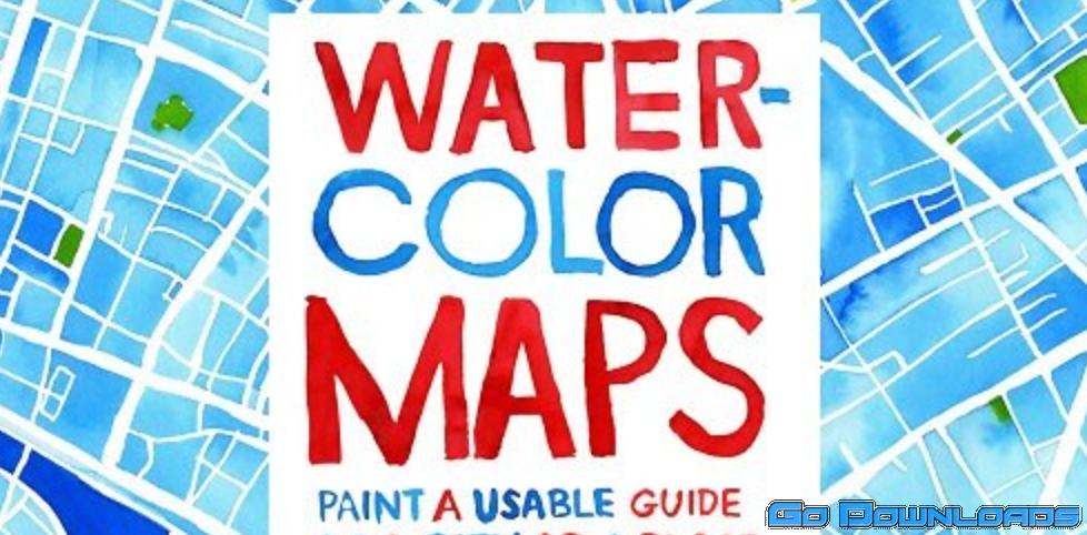
WATERCOLOR mapmaking: Paint a usable GUIDE of a city or place!
If you’re stuck inside and want to think differently about where you are and dream beyond the confines of your own home, you will make an engaging map that’s usable and aesthetically pleasing based on a few principles. Much in the spirit of my first course “Stuck at home self-portrait”, I’m all about using this current moment’s restraints and restrictions as fuel for inspiration. Even if you can’t hop on a plane and do hands-on research, you could create a map to your best friend’s house, a map from the couch to the refrigerator or a dream vacation you’ll book as soon as you can. And since I do live in Paris after all, I’ll walk students through Le Marais, an iconic Parisian neighborhood to research my own map which I will fully flesh out and execute on camera.
Like a lot of creative breakthroughs, my mapmaking style was the product of a challenge. It happened when I was developing the maps for my best-selling Rizzoli book “Paris in Stride”. I needed to straddle a balance between it being evocative of the iconic city while also being a usable guide to a neighborhood. Thanks to Google Maps and trial and error, I found my mapmaking stride which I share in this course. Since then, I’ve created maps for Chevrolet, AFAR, Free People and Vanity Fair France.
Watercolor is notoriously finicky, but I’ll share my own insider tips for filling in a uniform background, optimising white space and how to strategically think about color (using complimentary colors, color vs black and white) when executing a complex map.


